Community of Practice: Visualising data
Concept Development
My concept for this project will involve presenting a questionnaire to my followers on Instagram, utilising poll and question functions in the app’s Story feature to gain and collect answers from. I’ll then gather and convert these answers into spreadsheets, which will be uploaded onto a p5 Sketch, to be visualised in some way. I plan on taking these visualisations back to the social platform and sharing the results with the participants in the form of feed posts, so they can see how similar (or different!) we are to each other.
It’s important to note, I think, that the point of this data visualisation is not to necessarily provide extremely accurate information about a specific dataset. It doesn’t even need to provide super critical information either. It’s to explore how we utilise the numbers associated with social media platforms and connect them in a more meaningful and artistic way.
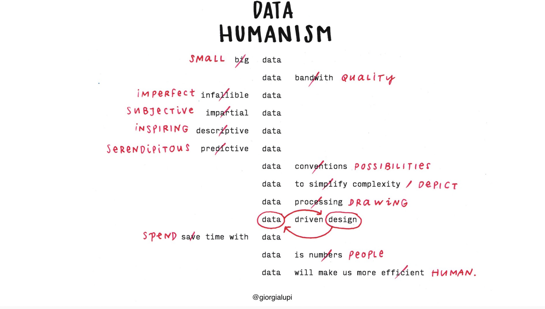
I’ve been especially inspired by my favourite information designer, Giorgia Lupi, the person behind Data Humanism, a visual manifesto. She’s passionate about using visual design language to convey information beyond statistical analysis; complex data insights that businesses sometimes prioritise over the people they are actually catering to. She personalises data and makes it ACCESSIBLE. As well as fun! These are some of my favourite projects of hers:
Plastic Air

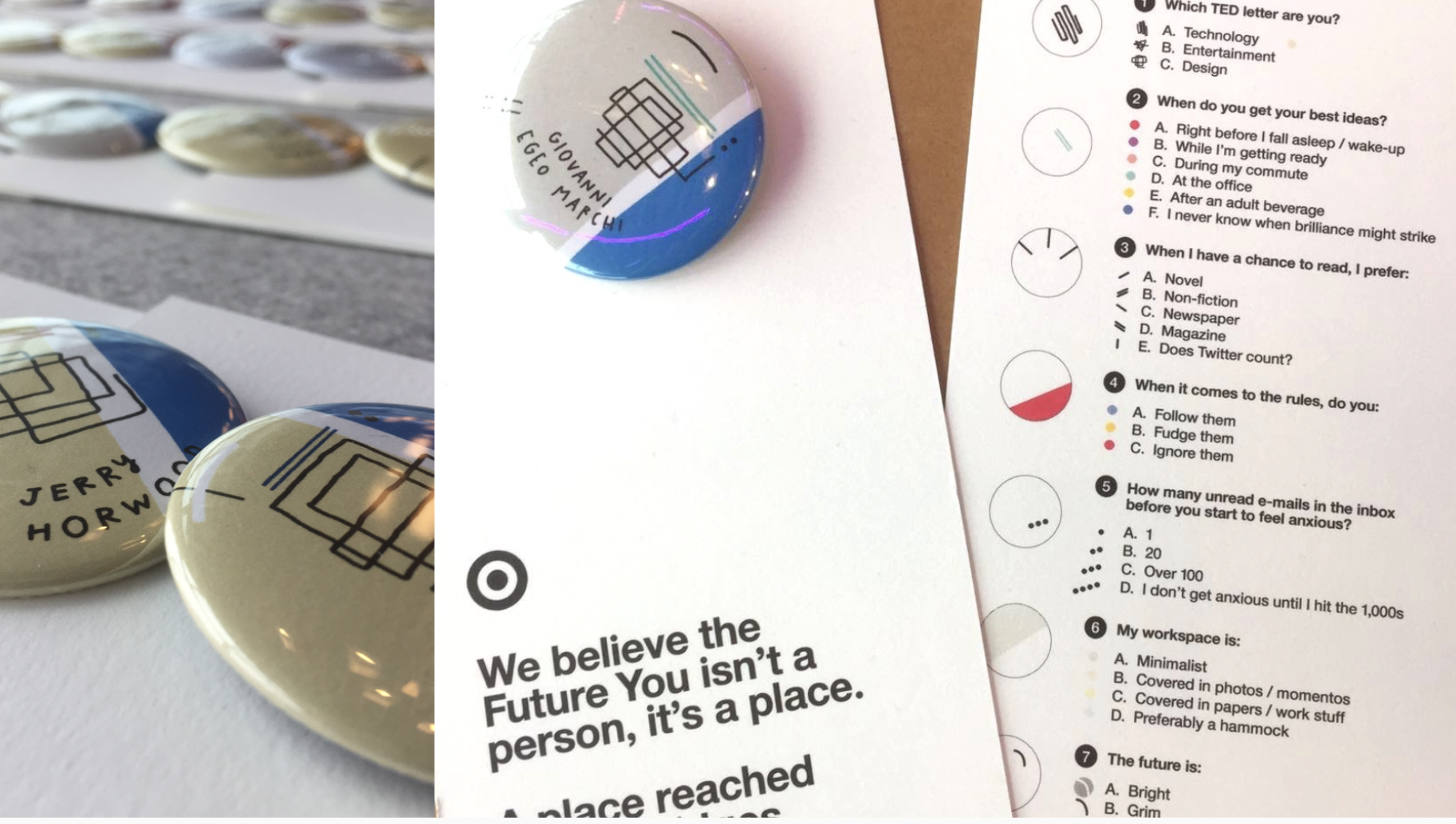
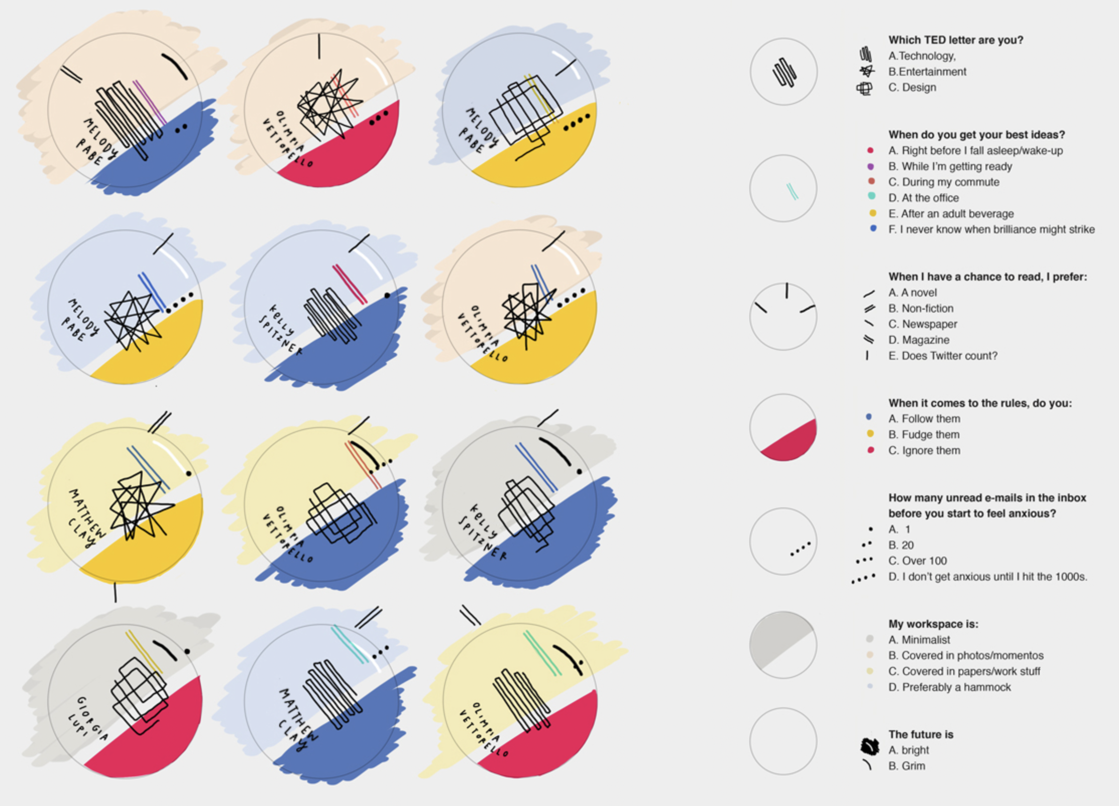
Data Portraits at TED
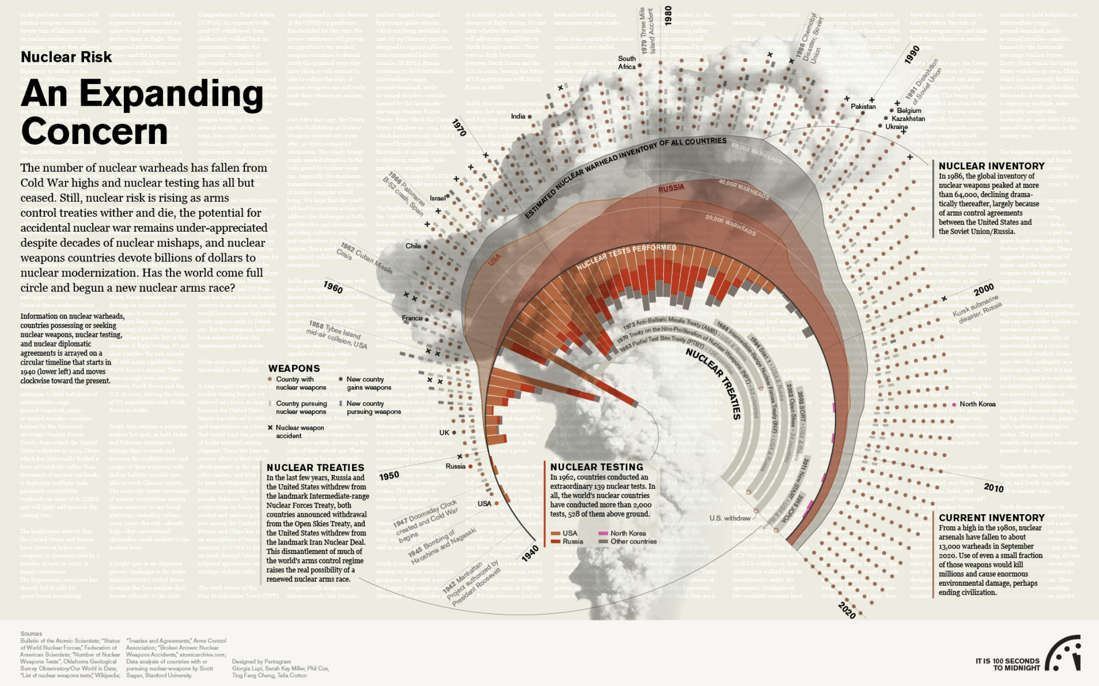
Bulletin of the Atomic Scientists
Data and p5
I've set out to test using data to create visualisations in the form of charts like you would in Excel. With the help of some tutorials () I've been using a csv (comma-separated value) file to create some basic bar charts, scatter plots, pies and donuts (yum).
Data Portraits at TED
Bulletin of the Atomic Scientists
Data and p5
I've set out to test using data to create visualisations in the form of charts like you would in Excel. With the help of some tutorials () I've been using a csv (comma-separated value) file to create some basic bar charts, scatter plots, pies and donuts (yum).Following a tutorial by Julius Gikonoyo to create a bar chart from a csv file
Using what I learnt to experiment with creating my own interpretation of the data
(Half) a pie chart!
Following a tutorial by Weidi to create a radial diagram
Scatter plot
Next
Back to home